Time Series data will lie to you, or take a random walk in Chicago.

Do you know that data lies? Come talk to me at MWSUG (Midwest SAS Users Group Conference) and I will help you protect yourself against lying data.

One of the papers i am presenting is on time series data. Time series analysis is pretty intense and there is as much art as science in its modeling. My paper is BL-101 “Exploring and characterizing time series data in a non-regression based approach.

Nobel Prize economist Ronald Coase famously said:  “If you torture the data long enough, it will confess.”  It will confess to anything, just to stop the beating. I think there is a corollary to that, “If you don’t do some interrogation, the data may just tell a lie, perhaps what you want to hear.

Consider the following graph, assembled with no torture at all and not even a short painless interrogation. The graph shows that money supply and the federal debt track each others time path very closely. It tempts you to believe what you see.  Do you believe that when the money supply increases we all have more to spend and this will translate into dept? Do you have an alternate reasoning that explains this movement? If so, this graph confirms your thoughts and you decide to use it to make or demonstrate or prove your point. Good stuff huh?

Sadly you just fell to confirmation bias and because you have failed to investigate the data generating process of the series, you fell for the lying data. You have found correlation, but not causation. in fact, you may have found a random walk.  Don’t cheer yet, that is not a good thing to make your case. 

But,” you think, “I like that graph and besides the correlation between Money Supply and Debt is really high so it has to mean something! right?

Sadly, no. 

Mathematically, if the series are random walks then changes in the series are only generated by random error. Which means the correlation between the two variables will be very low. 

A random walk takes the form of

y(t) = y(t-1) + e

which says that the currently observed variable at time t, is equal to the immediate past value plus a random error term. The problem here can be seen by subtracting y(t-1) from each side yielding a new and horrifying equation that says that any growth observed is purely random error, that is

Change in y = y(t) – y(t-1) = e.

Since you cannot write an equation to predict random error, it stands to reason that you cannot predict current or forecast future changes in the variable of interest.

Consider the next graph. The percentage change over the last year in the money supply is graphed against the percentage change over the last year of debt.  See a definite pattern? I do not. 

The correlation between money supply and debt in the first graph is 0.99 where 1.0 would be perfectly one-to-one related. In the second graph the correlation falls to 0.07 meaning there is almost no relationship between them.

The lesson: You should do more investigation, torture is not necessary, but no investigation is never desirable. 

Economists are obsessed in determining the data generating process (DGP)which take a lot of investigation. Economists know traps like random walks and know ways to find the true relationship between money supply and debt, if any. Ignore the DGP and your quick results could be a lie. Torture the data, and again you could find a lie (it just may take a long time of wasteful actions). 

So come take a random walk in Chicago with me at MWSUG. 

After the conference my paper will be available on the conference proceedings. 
A Data Science Book Adoption: Getting Started with Data Science

In my undergraduate business and economic analytics course, I have adopted Murtaza Haider‘s excellent text Getting Started with Data Science. I chose it for a lot of reasons. He is an applied econometrician so he relates to the students and me more than many authors. I truly have a very positive first impression. 

Updated: November 7, 2020

On my campus you can hear economics is not part of data science, they don’t do data science, that is, data science belongs to the department of statistics (no to the engineers, to the computer science department, and on and on like that.)  We have come a long way, but years ago, for example, the university launched a major STEM initiative and the organizers kept the economic department out of it even though we ask to be part of it. Of course, when they did their big role out, without our department, they brought in a famous keynote speaker who was … wait for it … an economist.

My department , just launched a Business Data Analytic economics degree in the College of Business Administration at the University of Akron.  We see tech companies filling up their data science teams with economists, many with PhDs. Our department’s placements have been very robust in the analytic world of work. My concern is seeing undergraduates in economics get a start in this field. and Murtaza Haider offers a nice path. 

Dr. Haider, has a Ph.D. in civil engineering, but his record is in economics, specifically in regional and urban, transportation and real-estate, and he is a columnist for the Financial Post. and I can attest to his applied econometrics knowledge based on his fine book which I explore below.

WHAT IS DATA SCIENCE

Haider has a broad idea of what is data science and follows a well-reasoned path on how to do data science. Like my approach to this class, he is heavy into visualizations through tables and graphics and while I would appreciate more design, he makes an effort to teach the communicative power of those visualizations. Also, like me, he is highly skeptical of the value of learning to appease the academic community at the expense of serving the business (non-academic) community where the jobs are. I really appreciate that part of it.

PROBLEM SOLVING AND STORYTELLING

He starts with storytelling. our department recognizes that what our economists do, what they do to bring value is they know how to solve problems and tell stories. Again this is a great first fit. He then moves to Data in a 24/7 connected world. He spends considerable time on data cleaning and data manipulation. Again I like how he wants students to use real data with all of its uncleanliness to solve problems. Chapter 3 focuses on the deliverables part of the job and again I think he is spot on. 

Then through the remaining chapters he first builds up tables, then graphs, and onto advanced tools and techniques. My course will stop somewhere in the neighborhood of chapter 8.

(Update: Chapter 8 begins with the binary and limited dependent variables, and full disclosure my last course did not begin this chapter, we ended in Chapter 7 on Regression). Perhaps the professor in the next course will consider Getting Started in Data Science for Applied Econometrics II.  (Update: Our breakdown in our Business Data Analytics economics degree is that Econometrics I is heavily coding and application-based, while econometrics II is a more mathematical/ theoretical based course with intensive data applications.  It is a walk before you run approach, building up an understanding of analysis and data manipulation first. )

I use a lot of team-based problem-based learning in my instruction and Haider’s guidance through the text is instructing teams how to think through problems to get one of many possible solutions, not highlighting only one solution. In this way, he reinforces both creativity in problem-solving. I like what I read, I wonder what I will think after students and I go through it this term. (Update: I/we liked the text, but did not follow it page by page.  The time constraint of the large data problem began to dominate and crowd out other things, hence why I did not get to Chapter 8, my proposed end. However, because in course 1 which emphasizes data results over theoretical knowledge, I was well pleased.)

PROBLEM ARTICULATION, DATA CLEANING, AND MODEL SPECIFICATION

Another reason I like the book so much is he cites Peter Kennedy, the now passed, research editor for the Journal of Economic Education. Peter was very influential on me and applied econometricians who really want to dig into the data. Most of my course is built around his work and especially around the three pillars of Applied Econometrics.: (1) the ability to articulate a problem, (2) the need to clean data, and (3) to focus deeply on model specification. He argues that most Ph.D. programs fail to teach the applied, allowing their time to focus on theoretical statistics and propertied of inferential statistics. Empirical work is often extra and conducted, even learned, outside of class. I have never taught like that (OK, maybe my first year out of my Ph.D.), but my last 40 years have been a constant striving to make sure my students are prepared for the real as opposed to the academic world. Peter made all the difference bringing my ideas into sharp focus. I like Haider’s work, Getting Started with Data Science, because it is written like someone who also holds the principles put forth by Peter Kennedy in high regard. 

SOFTWARE AGNOSTIC, BUT TOO MUCH STATA AND NOT ENOUGH SAS

On page 12 he gets much credit for saying he does not choose only one software, but includes “R, SPSS, Stata and SAS.” I get the inclusion of SPSS given it is IBM Press, but there is virtually no market for Stata (or SPSS)  in the state of Ohio or 100 miles around my university’s town of Akron, OH. Also, absent is python, which is in heavy use in the job market.  You can see the number of job listings mentioning each program in the chart below. 

I am highly impressed with Haider’s book for my course, but that does not extend to everything in the book. My biggest peeve is his heavy use of Stata. I would prefer a text that highlights the class language (SAS) more and was more sensitive to the market my students will enter.  

Stata is a language adopted by nearly all professional economists in the academic space and in the journal publication space, however, I think this use is misguided when the book is to be jobs facing and not academic facing. While he shows plenty of R, there is no python and no SAS examples. All data sets are available on his useful website, but since SAS can read STATA data sets that isn’t much of a problem.

Numbers for all of indeed.com listings in August 2019: Python, 70K; R 52K; SAS 26K, SPSS 3,789; Stata 1,868

SAS Academic Specialization

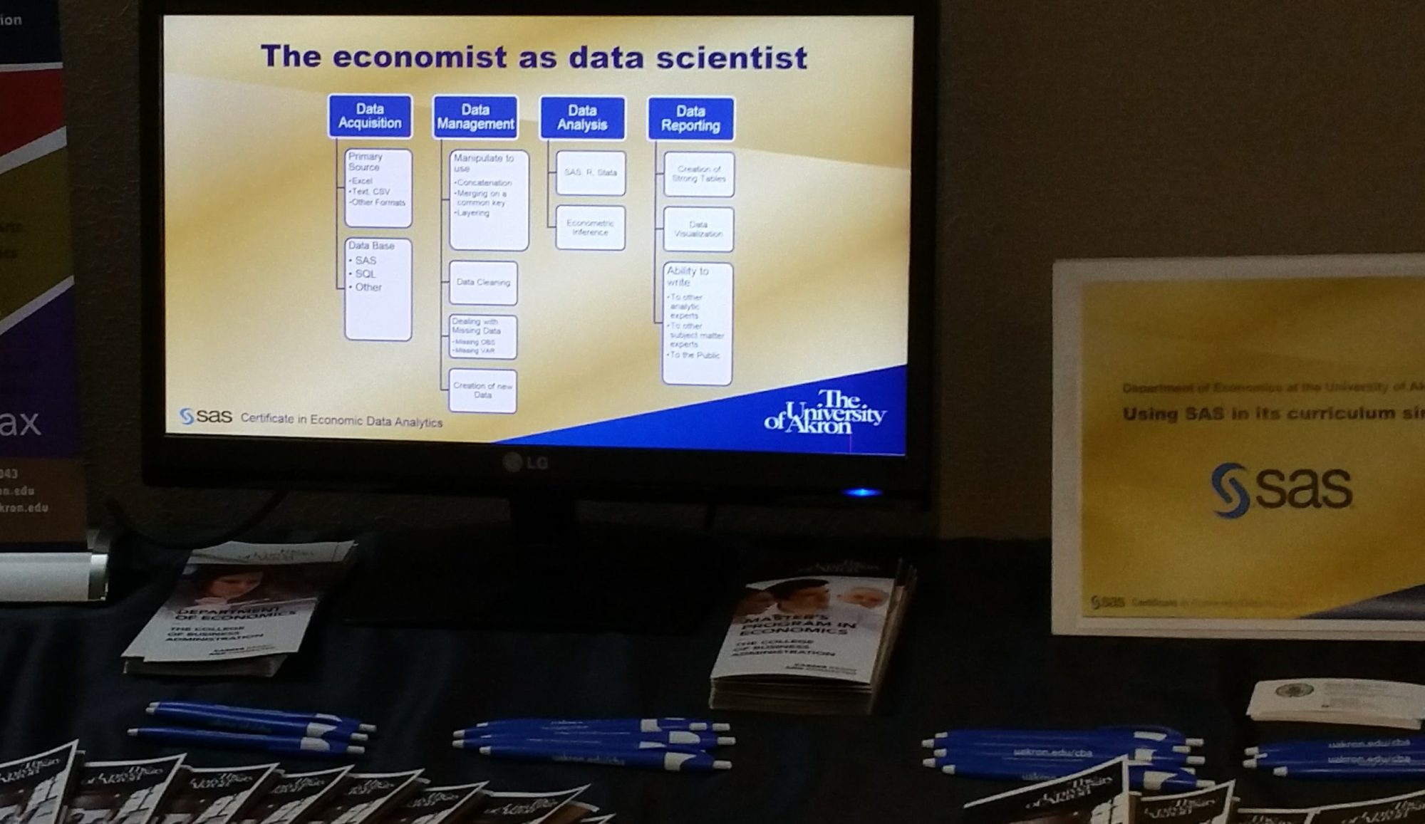
Full disclosure, we are a SAS school as part of the SAS Global Academic Program and offer both a joint SAS certificate to our students as well as offering them a path to full certification. 

(Update: The SAS joint certificate program has been rebranded and upgraded to the SAS Academic Specialization and is still a joint partnership between the college or university and SAS, but now in three tiers of responsibilities and benefits. We are at tier 3 and the highest level. Hit the link for more details.) 

We also teach R as well in our forecasting course and students are exposed to multiple other programs over their career including SQL, Tableau, Excel (for small data handling, optimization, and charting/graphics), and more. 

Buy This Book

Most typical econometric textbooks are in the multiple hundreds of dollars (not kidding) and almost none are suitable to really prepare for a job in data science. This book on Amazon is under $30 and is a great practical guide. Is it everything one needs? Of course not, but at the savings from $30 you can afford many more resources.

More SAS Examples

So it is natural given our thrust as a SAS School, that I would have preferred examples in SAS to assist the students. Nevertheless, I accepted the challenge to have students develop the SAS code to replicate examples in the book. This is a great way to avoid too much grading of assignments. Let them read Haider’s examples, say a problem that he states, and then solves with STATA. He presents both question and answer in STATA and my student’s task is to answer the problem in SAS. They can self check and rework until they come to the right numerical answer, and I am left helping only the truly lost.  

Overall, I love the outline of the book. I think it fits with a student’s first exposure to data science and I will know more at the end of this term. I expect to be pleased. (Update: I was.) 

If you are at all in data science and especially if you have a narrow idea that data science is only Machine Learning or big data, you need to spend time with this book, specifically read the first three chapters and I think you will have your eyes opened and a better appreciation of the field of data science.

Poverty Progress

Between 1980 and today the world is getting better, humans are making amazing progress. 

GDP per-capita in the US rose from $28,590 to $54,542, almost doubling as measured in 2010 dollars.

Worldwide, extreme poverty fell by over half as measured by the world bank.  (42 percent of the world’s population was in extreme poverty in 1981, but by 2015 only 9.9% of the world was in that state).

The number of wage salary workers that are paid at or below the federal minimum wage in the US fell from 15% to 2%.

The US Official Rate of Poverty rose by 0.5 percentage points.

Wait. What?

The world is improving even if you don’t think so.

Ask your friends about the drop in extreme poverty. I bet most get it wrong. My evidence is from the Misconception Study conducted by Gapminder Foundation. In fact, take their test to see how many misconceptions you have about the world. (It is right on the front page at https://www.gapminder.org/). Out of 12 questions administered to thousands across the world, the average score for every group is less than if the answer had been chosen by random. 

Once misconception is the world is getting worse, when indeed it is really getting much much better. But stories of better do not lead the news, only stories of woe. Further if you got your education in the 70s and 80s as I did you may have many misconceptions simply because you believe data learned correctly then has not changed. 

Why has the official poverty rate not fallen with all this world wide progress?

If world extreme poverty is down, why is the US official poverty rate so flat, nearly the same now as almost 50 years ago? The first problem is world wide poverty is bench marked on an absolute income standard. The OPR in the US is a relative income standard. They measure very different things. 

The second problem is income is the wrong measure for poverty. Using bad measures of important concepts like poverty creates a misconception that the problem is much worse and virtually unsolvable and attracts policy prescriptions to do exactly the wrong thing. 

The World Bank expects Extreme Poverty to essentially vanish by 2030. The US government has made no such forecast by any year in the future. 


What is the better measure of US poverty?

Meyer and Sullivan track what it costs to consume at a level not to be in poverty, that is, to create a consumption poverty rate (CPR) that is shown on the last track. The better question is not do the US poor have enough income, but do they have enough consumption? Without getting into what poverty programs are good and bad, the case of food stamps, now SNAP, is such instructive. Take two families with identical income and one of them received one or more consumption based forms of assistance such as SNAP and clearly one is relatively better off. The OPR does no consider any assistance to the people in poverty that they measure. 

But a goal to eradicate poverty needs to be based against an absolute standard with policy clearly targeting families to get them across that standard. We do not want people deprived. It is not about income, its about existence beyond deprivation. 

One of the reasons for the consumption poverty rate (CPR)  is consumption is a better predictor of deprivation than income. (Perhaps two people have the same income, but one cannot afford to put good food on the table, who is worse off?).

You can find their excellent paper here (https://leo.nd.edu/assets/249750/meyer_sullivan_cpr_2016_1_.pdf)

To listen to the news media and the advocacy groups everything is a crisis and a disaster and the world and the US is getting worse. The nice thing about data is it proves the obverse, the world and the US is getting better at a rate begun in about 1980 that is astonishing. But good news does not bleed and therefore will not lead.

So here is what is remarkable: From 1980 to 2015 the consumption poverty rate fell by 9.4 percentage points, while the official poverty rate rose by 0.5 percentage points.

So what make more sense, that the US has a poverty rate of 13.5 (in 2015) that is virtually impossible to lessen or eliminate, or a Poverty rate based on consumption that is 3.5% of the population that we might be able to further reduce.  

I would like to see the end of poverty wouldn’t you? 

Be a Data Skeptic and do your own research

We hear constantly about bias reporting and fake news and you should be motivated to be skeptical about any data you hear reported and motivated to search out the actual facts.

In other cases, such as the FBI’s hate crime data, the data are not reliable without understanding how it is collected. The data is fine, but year to year comparisons are not easily possible because of the data design. (see The importance of data skepticism. Hate crimes did not rise 17% in one year. )

Many data websites do exist to help you find actual facts. 

Some of the best fact based sites are
https://Justfacts.org
https://Gapminder.org
https://Fred.org
https://humanprogress.org.

So the message is be humble, don’t believe everything at face value and learn how and do your own research.

Data Analytic Jobs in Ohio – May/June 2019

“Economists put the science in data science,” at least that is how the tag line goes on this blog. As we address our new Business Data Analytics degree in the College of Business Administration we need to know if our earlier plans for what is taught technically is still a good idea. Currently we teach SAS, R, and Tableau in Economics and students get SQL and JMP in other business courses. 

Searches for jobs in Ohio and within 100 miles of Arkon Ohio were preformed by the author on Indeed.com to see how many jobs included certain key words. The geographical area “Ohio” is well known and bounded, the area “100 miles of Akron” includes jobe no only in NE Ohio, but includes jobs outside NE Ohio as this definition touches the circle of influence of the Columbus area and the Pittsburg area. There is no way to know whether all jobs in Columbus and Pittsburg are counted or only those to the NE and NW respectively of both cities. 

Software Preference

SQL is the most mentionned software/language by far. After that R, Python, SAS and Tableau ranked in that order. Java and HTML are mostly used in web design and non analytic use. Salesforce was included because of the decision this week to acquire Tableau. 

Two interesting points. (1) Excel was originally included and eliminated from Figure 1, because Excel was mentionned in 19,370 jobs in Ohio and 12,129 for jobs with 100 miles of Akron, OH. (2) SAS and SQL was examined with the result that 60% of SAS jobs in Ohio and 67% of SAS jobs within 100 miles of Akron also included mention of SQL. 

Figure 1: Job including software. The software was included in the description, but not distinguished whether recommended or required. Source: authors calculations.

SAS Presence

There are a good number of SAS mentions which is good for our students since we are a SAS program offering a SAS Certificate in Economic Data Analytics.  As figure 2 shows, SAS is preferred by those employed by business, statistics and economics degree holders and figure 3 shows a preference for SAS in Fortune 500 companies. 

Figure 2 SAS use highest among Business, statistics and economics degree holders employed and surveyed. Source: Butchworks.com.
Figure 3: SAS preferred by Fortune 500 company employees. Source: Butchworks.com.

Skill areas included

Searches were also done by key words, not just on software with the results shown in Figure 4. Shocking to economists is that “econometrics,” the study of applying data analysis to typically economi data has only 29 listings in Ohio. However, every econometric student knows regression and logit and statistical inference and prediction and forecasting and more, and we know most economics students go into data analytics with ease, so what to conclude. The term econometrics is foreign to the job opportunity listings and perhaps it is time for a more relevant and descriptive naming of what is taught in econometrics.  

A typical economics student and especially one who gets our new Business Data Analytics can compete for most of the jobs including each of the keywords shown below making the new degree a very robust and rewarding one.  

Figure 4: Key terms of skills included at Indeed.com. Source: authors calculations.

Wraping up

To complete the analysis of jobs, Figure 5 shows that jobs mentioning “management” is incredibly large. i speculate that this is because job descriptions include not only jobs for managers, but also word use such as “reporting to management” and “data management.” 

Nevertheless, by including the names of departments in our college (except accounting), we get a sense of opportunities for various of our college majors, but a deeper search looking at sub fields such as supply chain, human resources, risk, insurance would have to be done, but the numbers are suggestive. 

Just like Excel as discussed above, the word “data” is mentionned in nearly 20,000 jobs in Ohio and almost 13,000 within 100 miles of Akron. So many jobs now require data savy on the part of employees that any of the colleges degrees offered in teh college of buainess administration at the University of Akron (including accounting) leads to lots of openings  advertising for their data skills.  

And the bottom line

Our new economics degree, Business Data Analytics promisses to produce graduates in high demand.

Figure 6: Mentions of the names of the various departments in the college and a comparison to searches for the word "data" and "Excel." Source: authors calculations.

Testing for a structural break

Ever throw a dummy variable in a regression to see whether the effect the dummy variable is measuring has an impact on the dependent variable? Ever find that the dummy variable had the wrong sign, was of small magnitude or had vastly large variance so that you decided based on your data that the effect measured by the dummy variable had no effect? Of course you have, we all have.

But did you know that your data may be lying to you?

This presentation is an exploration of whether a time series changes based on an intervention that occurs half way through the data. Perhaps the intervention is a new law, or a treatment of some kind, did it have an effect. In our example, the dummy variable is insignificant in the first instance, model specification is in doubt and a full-on testing strategy is developed. That is, the test of whether D, the dummy variable, effects Y, the outcome measure is more than a p-test in a simple single regression, much more. Check out the classroom presentation and I will eventually load all the SAS code here to run all 8 regressions required and the multiple tests of each regression to answer the original hypothesis that D matters.

A Github Economics and Data Science repository

Vikesh Vkkoul, an analyst with an MA in Applied Economics, has a nicely done collection of articles and more of Economics and Data Science at github. He also has a good set of Data Science Resources on his site as well. Check him out.

NABE Tech Conference on Economics in the Age of Algorithms, Experiments and AI – Presentations available

photo credit: NABE.com

I browsed to this 2018 conference site put on by the National Association of Business Economists last October 2018. The program looked top rated with Economists in Data Science presenting over three days. Truly one of those wish I had been there moments. Next best thing is the addition under the Materials tab of many of the presentations.

i personally enjoyed the presentations by Chamberlain (What Can Crowdsourced Salaries Tell Us About the Labor Market? Chief economist at Glassdoor), Dunn (From Transactions Data to Economic Statistics: Constructing Real-time, High-frequency, Geographic Measures of Consumer Spending, Federal Reserve Board), Groshen (Preparing U.S. Workers & Employers for an Autonomous Vehicle Future, Cornel), Konny (Using BIG Data to Improve the Consumer Price Index, BLS) (wow) the most with two others that are outstanding:

Katheryn Shaw (Management in the Age of AI: An Economist’s Perspective, Stanford) and Hal Varian (Automation v Procreation, Google Chief Economist) is in my humble opinion the overall winner with a presentation on automation and work.

Check it out and enjoy.

Amazon’s Secret Weapon: Economic Data Scientists

Excellent read from CNN Business, how Economists help Amazon gets its edge. It is a premise of this blog that economics puts the science in data science and that economics is great training for the data science field, bringing so much value for businesses.

Photo credit: CNN.org

https://www.cnn.com/2019/03/13/tech/amazon-economists/index.html

Proof that Economics puts the Science in Data Science: “What I’ve seen change in the industry, starting about eight years ago, is firms got more serious about using the scientific method and removing chunks of guesswork within companies,” an Amazon economist said, with a characteristic nervous laugh in between sentences. “You’re basically trying to clean up waste.”

Originally, the company brought on a team of psychologists, other scientists and product managers, but before long, it became apparent that they weren’t well suited to achieving what Amazon was ultimately after: Better performance. Economists, by contrast, were able to analyze which interventions led to higher worker productivity.

Why not use traditional data scientists? “They kind of make the point that economists have more specific skill sets that are better suited for a lot of business problems,” a former Amazon staffer said.

The Importance of Data Skepticism – Hate crimes did not rise 17 percent in one year.

The video embeded here by Johan Norberg caught my attention with the title “skewed crime reporting” which I read as “skewed data reporting.” Comparing 2016 and 2017 Department of justice statistics on hate crime, that hate crimes rose 17% in one year. This is reported in the Washington Post, AP news, Vox.com, NBCnews, and the NY Times (and those were only the first 6 hits in my Google search on ‘hate crimes up 17%.’ The Hill.com reported that it was the third year in a row that hate crimes had increased.

Seventeen percent! That is a huge increase and since this is now two back to back increases that seems to say that there is something very wrong these days. One may reasonably expect the data in 2018 to again show an increase. Three years in a row, then possibly four? What are we to do?

Well we can start by not comparing Apples to Oranges

All economics students are taught in their data courses and I hope all who dabble in data analysis and data science are as well, to understand the data generating process (DGP) of the data? What is it and how reliable is it. One would think it is great and useful data because is seems comprehensive and is government data published by the Department of Justice data on the fbi.gov website at 2017 Hate Crime Statistics and 2016 Hate Crime Statistics. It’s governmental data, we do not have to be concerned, correct? In this case there is every reason to be skeptical. See first two paragraphs by the FBI UCR Hate Crime Summary, specifically the changing base of the numbers and the non estimation of hate crimes in an area that does not report. I was rejoicing in the fact that the FBI did not quote the 17% increase, but was disappointed to find that they did. I now hope it was not the careful data professionals, but the misinterpretation of a press officer. Why disappointed? Read on.

I learned my data / statistical skepticism from a 1954 book by Darrell Huff called How to Lie with Statistics and have required it in nearly every data class I have taught. So simple, and so devious, most are simple misrepresentation of the facts. You can’t have your own facts, but your manipulation or interpretation may be nonfactual and faulty. In the data course in which I taught last fall I required a free download by Cathy O’Neil On Being a Data Skeptic. And there are other fine resources, but to have my students first distrust anything about data is quite the goal.

Cathy O’Neil’s author page can be found here. To hear about her book Weapons of Math Destruction, listen in to her conversation with Russ Roberts (@econtalker) at Econ Talk.

All economic students are cautioned or should be cautioned to be skeptical with all data sources, understanding the DGP, but also looking for the year to year changes in methods or wording or scope or instructions. I did not look for, nor would I expect to find a set of instructions sent out with the 2017 survey to reporting agencies to pay particular interest to this or that differently than in 2016, but if I were to analyzing this data I should. Some EDA methods are advisable for economists, (those that inform the researcher, but not those that purport to find truth from data, the latter introducing the inherent bias that correlation is causation), but, alas, I suspect even that would reveal little here. This problem is more fundamental, it is in the base.

Agencies report the hate crimes. Is it only a 10.7 percent increase?

Each year’s data is assembled from the reporting agencies in their sample and that is the problem. The number of agencies between 2016 and 2017 rose by 5.9%, 895 additional agencies in the sample. However, agencies that reported at least one hate crime rose from 1776 to 2040, 14.6 percent increase, near the 17 percent increase in hate crimes. So did hate crimes increase significantly, or was it just because more new agencies join the reporting network? The latter casts doubt on the former reliability.

yearNo. of
agencies
No. of
agencies
reporting hate
crimes
No. of
hate
crimes
reported
No. of
hate
crimes
per
agency
No. of
hate
crimes
per
agency
that
reported
hate
crimes
Source of Data
201615,254177661210.4013.45https://ucr.fbi.gov/hate-crime/2016 
201716,149204071750.4443.52https://ucr.fbi.gov/hate-crime/2017
change 8952641,0540.0430.071
Percent
change
5.9%14.9%17.2%10.7%2.0%

To examine that is beyond this blog post, but I would start with restricting the sample 16,149 agencies in 2017 to only those 15,254 that reported in 2016. In those 15,254 areas by how much is hate crimes increased? I bet it wouldn’t be 17%. in the table I estimate the increase of hate crime to be 10.7%, but I am not comfortable with that measure either.

Not all agencies report hate crimes, perhaps it is only a 2 percent increase.

I every agency that reported for the first time reported just one crime each it accounts for almost the entire increase suggests Johan Norberg quoting or at least referencing Robby Soave in reason.com. So I am led to a different way of thinking about whether hate crimes have increased. What if we took only those 1,776 agencies in 2016 that actually reported hate crimes and then looked at only those agencies in 2017 to see what they report. Again that is beyond this blog entry, but as a crude proxy, lets compare the agencies that reported hate crimes in 2016 with the 2,040 agencies that reported in 2017. What do we find? in 2016 there were 3.44 hate crimes reported on average by the 1,776 agencies which rose to 3.52 hate crimes reported on average in 2017 by the 2,040 agencies which suggests that hate crimes rose by 2 percent, not 10 percent and certainly not 17.

Susan Athey on the Impact of Machine Learning on Econometrics and Economics (part 2)

I posted Susan Athey’s 2019 Luncheon address to the AEA and AFA in part 1 of this post.  (See here for her address).

Now, in part 2, I post details on the continuing education Course on Machine Learning and Econometrics from 2018 featuring the joint efforts of Susan Athey and Guido Imbens.

It relates to the basis for this blog where I advocate for economists in Data Science roles. As a crude overview, ML uses many of the techniques known by all econometricians and has grown out of data mining and exploratory data analysis, long avoided by economists precisely because such methods lead to in the words of Jan Kmenta “beating the data until it confesses.” ML also makes use of AI type methods that started with brute force methods noting that the computer can be set lose on a data set and in a brutish way try all possible models and predictions seeking a best statistical fit, but not necessarily the best economic fit since the methods ignore both causality and the ability to interpret the results with a good explanation.  

Economists historically have focused on models that are causal and provide the ability to focus on the explanation, the the ability to say why. Their model techniques are designed to test economic hypotheses about the problem and not just to get a good fit. 

To say we have discussed historically the opposite ends of a fair coin by setting up the effect of X–>y is not too far off. ML focuses on y and econometrics focus on X. The future is focusing on both, the need to focus good algos on what is y and the critical understanding of “why” which is the understanding of the importance of X.  

This course offered by the American Economic Association just about one year ago, represents the state of the art of the merger of ML and econometrics.  I offer it here (although you can go directly to the AEA website) so more can explore how economists need to incorporate the lessons of ML and of econometrics and help produce even stronger data science professionals. 

AEA Continuing Education Short Course: Machine Learning and Econometrics, Jan 2018

Course Presenters

Susan Athey is the Economics of Technology Professor at Stanford Graduate School of Business. She received her bachelor’s degree from Duke University and her PhD from Stanford. She previously taught at the economics departments at MIT, Stanford and Harvard. Her current research focuses on the  intersection of econometrics and machine learning.  As one of the first “tech economists,” she served as consulting chief economist for Microsoft Corporation for six years.

Guido Imbens is Professor of Economics at the Stanford Graduate School of Business. After graduating from Brown University Guido taught at Harvard University, UCLA, and UC Berkeley. He joined the GSB in 2012. Imbens specializes in econometrics, and in particular methods for drawing causal inferences. Guido Imbens is a fellow of the Econometric Society and the American Academy of Arts and Sciences. Guido Imbens has taught in the continuing education program previously in 2009 and 2012.

Two day course in nine parts - Machine Learning and Econometrics, Jan 2018

 Materials:

Course Materials (will attach to your Google Drive)

The syllabus is included in the course materials and carries links to 4 pages of readings which are copied and linked to the source articles below.

Webcasts:

View Part 1 – Sunday 4.00-6.00pm: Introduction to Machine Learning Concepts 

(a) S. Athey (2018, January) “The Impact of Machine Learning on Economics,” Sections 1-2. 

(b) H. R. Varian (2014) “Big data: New tricks for econometrics.” The Journal of Economic Perspectives, 28 (2):3-27.

(c) S. Mullainathan and J. Spiess (2017) “Machine learning: an applied econometric approach” Journal of Economic Perspectives, 31(2):87-106  

View Part 2 – Monday 8.15-9.45am: Prediction Policy Problems

(a) S. Athey (2018, January) “The Impact of Machine Learning on Economics,” Section   3. 

(b) S. Mullainathan and J. Spiess (2017) “Machine learning: an applied econometric approach.” Journal of Economic Perspectives, 31(2):87-106. 


View Part 3 – Monday 10.00-11.45am: Causal Inference: Average Treatment Effects

(a) S. Athey (2018, January) “The Impact of Machine Learning on Economics,” Section 4.0, 4.1. 

(b) A. Belloni, V. Chernozhukov, and C. Hansen (2014) “High-dimensional methods and inference on structural and treatment effects.” The Journal of Economic Perspectives, 28(2):29-50. 

(c) V. Chernozhukov, D. Chetverikov, M. Demirer, E. Duo, C. Hansen, W. Newey, and J. Robins (2017, December) “Double/Debiased Machine Learning for Treatment and Causal Parameters.” 

(d) S. Athey, G. Imbens, and S.Wager (2016) “Estimating Average Treatment Effects: Supplementary Analyses and Remaining Challenges.”  Forthcoming, Journal of the Royal Statistical Society-Series B.

View Part 4 – Monday 12.45-2.15pm: Causal Inference: Heterogeneous Treatment Effects

(a) S. Athey (2018, January) “The Impact of Machine Learning on Economics,” Section 4.2. 

(b) S. Athey, G. Imbens (2016) “Recursive partitioning for heterogeneous causal effects.” Proceedings of the National Academy of Sciences, 113(27), 7353-7360.

View Part 5 – Monday 2.30-4.00pm: Causal Inference: Heterogeneous Treatment E ects, Supplementary Analysis

(a) S. Athey (2018, January) “The Impact of Machine Learning on Economics,” Section 4.2, 4.4. 

(b) S. Athey, and G. Imbens (2017) “The State of Applied Econometrics: Causality and Policy Evaluation,” Journal of Economic Perspectives, vol 31(2):3-32.

(c) S. Wager and S. Athey (2017) “Estimation and inference of heterogeneous treatment effects using random forests.” Journal of the American Statistical Association 

(d) S. Athey, Tibshirani, J., and S.Wager (2017, July) “Generalized Random Forests

(e) S. Athey, and Imbens, G. (2015) “A measure of robustness to misspeci cation.” The American Economic Review, 105(5), 476-480.

View Part 6 – Monday 4.15-5.15pm: Causal Inference: Optimal Policies and Bandits

(a) S. Athey. (2018, January) “The Impact of Machine Learning on Economics,”
Section 4.3. 

(b) S. Athey and S. Wager (2017) “Efficient Policy Learning.”

(c) M. Dudik, D. Erhan, J. Langford, and L. Li, (2014) “Doubly Robust Policy
Evaluation and Optimization” Statistical Science, Vol 29(4):485-511.

(d) S. Scott (2010), “A modern Bayesian look at the multi-armed bandit,” Applied Stochastic Models in Business and Industry, vol 26(6):639-658.

(e) M. Dimakopoulou, S. Athey, and G. Imbens (2017). “Estimation Considerations in Contextual Bandits.” 

View Part 7 – Tuesday 8.00-9.15am: Deep Learning Methods

(a) Y. LeCun, Y. Bengio and G. Hinton, (2015) “Deep learning” Nature, Vol. 521(7553): 436-444.

(b) I. Goodfellow, Y. Bengio, and A. Courville (2016) “Deep Learning.” MIT Press.

(c) J. Hartford, G. Lewis, K. Leyton-Brown, and M. Taddy (2016) Counterfactual
Prediction with Deep Instrumental Variables Networks.” 

View Part 8 – Tuesday 9.30-10.45am: Classi cation

(a) L. Breiman, J. Friedman, C. J. Stone R. A. Olshen (1984) “Classi cation and
regression trees,” CRC press.

(b) I. Goodfellow, Y. Bengio, and A. Courville (2016) \Deep Learning.” MIT Press.

View Part 9 – Tuesday 11.00am-12.00pm: Matrix Completion Methods for Causal Panel Data Models

(a) S. Athey, M. Bayati, N. Doudchenko, G. Imbens, and K. Khosravi (2017) “Matrix Completion Methods for Causal Panel Data Models.” 

(b) J. Bai (2009), “Panel data models with interactive fi xed effects.” Econometrica, 77(4): 1229{1279.

(c) E. Candes and B. Recht (2009) “Exact matrix completion via convex optimization.” Foundations of Computational Mathematics, 9(6):717-730.