How to be the best Economic Data Scientist: The Seven Tools of Causal Inference and Ethics

Originally published on November 21, 2019, on LinkedIn, updated lightly October 29, 2022

My blog tagline is economists put the science into data science. Part of the reason I make this claim is many applied econometricians (sadly not all) place a high value on causality and causal inference. Further, those same economists will follow an ethic of working with data that is close to the 2002 guidance of Peter Kennedy and myself.

Judea Pearl discusses “The Seven Tools of Causal Inference with Reflections on Machine Learning” (cacm.acm.org/magazines/2019/3/234929), a Contributed Article in the March 2019 CACM.

This is a great article with three messages.

The first message is to point out the ladder of causation.

  1. As shown in the figure, the lowest rung is an association, a correlation. He writes it as given X, what then is my probability of seeing Y?
  2. The second rung is intervention. If I do X, will Y appear?
  3. The third is counterfactual in that if X did not occur, would Y not occur?

In his second message, he discusses an inference engine, of which he says AI people and I think economists should be very familiar. After all, economists are all about causation, being able to explain why something occurs, but admittedly not always at the best intellectual level. Nevertheless, the need to seek casualty is definitely in the economist’s DNA. I always say the question “Why?” is an occupational hazard or obsession for economists.

People who know me understand that I am a huge admirer, indeed a disciple of the late Peter Kennedy (Guide to Econometrics, chapter on Applied Econometrics, 2008). Kennedy in 2002 set out the 10 rules of applied econometrics in his article “Sinning in the Basement: What are the rules.” I think they imply practices of ethical data use and are of wider application than with Kennedy’s intended audience. I wrote about Ethical Rules in Applied Econometrics and Data Science here.

Kennedy’s first rule is to use economic theory and common sense when articulating a problem and reasoning a solution. Pearl in his Book of Why explains that one cannot advance beyond rung one without other outside information. I think Kennedy would wholeheartedly agree. I want to acknowledge Marc Bellemare for his insightful conversation on the combination of Kennedy and Pearl in the same discussion of rules in applied econometrics. Perhaps I will write about that later.

Pearl’s third message is to give his seven (7) rules or tools for Causal Inference. They are

  1. Encoding causal assumptions: Transparency and testability.
  2. Do-calculus and the control of confounding.
  3. The algorithmization of counterfactuals. 
  4. Mediation analysis and the assessment of direct and indirect effects.
  5. Adaptability, external validity, and sample selection bias.
  6. Recovering from missing data. 
  7.  Causal discovery.

I highly recommend this article, followed by the Book of Why (lead coauthor) and Causal Inference in Statistics: A Primer. (lead coauthor). Finally, I include a plug for a book in which I contributed a chapter on ethics in econometrics, Bill Franks, 97 Things About Ethics Everyone in Data Science Should Know: Collective Wisdom from the Experts.
Do you know how many minimum wage workers there are? Less than you think.

Originally posted on LinkedIn on March 7, 2021, Lightly updated on October 29, 2022.

Subtitle: Please, OHIO, do not pass the raise the wage act as a constitutional amendment.

Do you know how many workers are paid the minimum wage? How big is the problem?

In 2021 it was 1.091 million workers or 1.4 percent of the total wage and salary workers in the US (and less than 0.8 percent of all workers paid wage or salaried).

For nine years, I taught survey methods in a course then called Computer Skills for Economic Analysis. It featured lots of data work and programming leading to economic analysis. (It has since been remastered and renamed econometrics I required as core in the College of Business). One task was to have students update and administer a survey to at least 30 people, asking but not requiring them to try to survey a full age range of people (not just their same-age friends). What resulted was about 4,700 observations over the near-decade. It gave good practice in collecting and merging data and then analyzing questions.

Students and people are unrealistic and pessimistic

One thing that stood out was when we asked what was the unemployment and inflation rate; the answers were amazingly overstated. These were numbers that most people had no idea about, but when asked, they always tended to forecast worse than the actual rates and not by a few percentage points either. Pessimism seemed to reign, and students and respondents always leaned heavily toward the worst case.

The same is the case about whether the minimum wage should be raised, specifically how many people are affected by the minimum wage directly, that is, how many are paid at or below the minimum wage? I always found that even my class of economists overstated this number as well, and again not by a few percentage points.

Students saw being paid at or below minimum wage as a larger problem than it is. They saw the number of persons affected by minimum wage as a relatively large portion of the economy. And they didn’t correctly see the minimum wage as primarily being among the young, inexperienced, and uneducated.

Why they are so pessimistic is an important question not addressed here, but many in the media and political world do benefit from that pessimism.

What are the facts?

The answer to the question is in an annual report from the US Bureau of Labor Statistics, Characteristics of Minimum Wage Workers (the most recent report is for 2021 at https://www.bls.gov/opub/reports/minimum-wage/2021/home.htm (although the graph below was created on data for 2020 at https://www.bls.gov/opub/reports/minimum-wage/2020/home.htm).)

In 2021, after the COVID recession, fewer workers are paid at or below minimum wage, and they represent an even lower percentage of the total hourly workers than in 2020. (1.091 million and 1.4 percent). By the way, of the 1.091 million workers, only 181,000 were paid at the minimum wage, and 910,000 were paid below due to exceptions and carveouts in the law.

What else can we learn from the BLS report?

Of the 1.091 million workers paid hourly at or below the minimum wage

  • 44.3 percent are 24 years or younger. (Table 1)
  • 52.0 percent are part-time workers (Table 1)
  • 52.8 percent are in the Southern states (Table 2)
  • 73.7 percent are in Service industries (Table 4)
  • 14.9 percent have less than a high school diploma (Table 6)
  • 34.4 percent have a high school diploma and no college (Table 6)
  • 27.2 have some college and no degree (Table 6)
  • 8.8 percent have an Associate degree (Table 6)
  • 12.3 percent have a Bachelor’s degree (Table 6)
  • 65.0 percent are never married (Table 8)
  • 16.4 percent are married, spouse present, and over 25. (Table 8)

In 2021, 76.1 million workers aged 16 and older in the United States were paid at hourly rates, representing 55.8 percent of all wage and salary workers. The percentages shown above are all based on hourly workers.

1.5 percent of hourly workers are paid at or below the minimum wage. This is the same as saying that 0.8 percent of all workers are paid at or below the minimum wage.

The size of the problem is very small.

And in Fall 2022, the Raise the Wage Act is on the Ohio Ballot

You can read the petition on the attorney general’s website here: https://www.ohioattorneygeneral.gov/getattachment/3d285cd7-aeea-4c65-948c-b1cea8a2da3a/Raise-the-Wage-Ohio-(Re-Submission).aspx.

This is bad legislation, and even more so by attempting to change the constitution. Ohio voters may want to pass this because they think it is going to do some good, but the good part will be swamped by the bad.

In another post, I wrote about the US raise the wage act introduced in 2021. (see https://econdatascience.com/understanding-the-minimum-wage-effects-on-the-economy)

The CBO said the act if passed, would reduce employment by 1.4 million persons, but in this post, you can see that only 1.091 million are currently paid at or below the minimum wage. The disemployment effects would be devastating. The CBO said it would lift 0.9 million out of poverty. But in that post, I show that poverty is already falling.

The worker who faces disemployment is the least productive among all of the low-wage workers. An employer having the potential of hiring a dropout with poor job skills and a student in college will almost always take the ‘better’ hire. At an extreme, the former never gets work and needs it the most, while the latter will, on their own, grow into a better job as they complete their education. So the minimum wage hurts those who advocates suggest it should help the most.

Avoiding Pitfalls in Regression Analysis

(Updated with links and more Dec 1, 2020. Updated with SAS Global Forum announcement on Jan. 22, 2021.)

Professors reluctant to venture into these areas do no service to their students for preparation to enter the real world of work.

Today (November 30, 2020)  I presented: “Avoiding Pitfalls in Regression Analysis” during the Causal Inference Webinar at the Urban Analytics Institute in the Ted Rogers School of Management, Ryerson University. I was honored to do this at the kind invitation of Murtaza Haider, author of Getting Started with Data Science.  Primary participants are his students in Advanced Business Data Analytics in Business. This is an impressive well-crafted course (taught in R) and at the syllabus-level covers many of the topics in this presentation. I met Murtaza some time ago online and have come to regard him as a first-rate Applied Econometrician.

Ethics and moral obligation to our students

Just as Peter Kennedy developed rules for the ethical use of Applied Econometrics, this presentation is the first step to developing a set of rules for avoiding pain in one’s analysis. A warning against Hasty Regression (as defined) is prominent.

(Update 1/22/2021: My paper, “Haste Makes Waste: Don’t Ruin Your Reputation with Hasty Regression,” has been accepted for a prerecorded 20 minute breakout session at SAS Global Forum 2021, May 18-20, 2021. More on this in a separate post later.)

Kennedy said in the original 2002 paper, Sinning in the Basement, “… my opinion is that regardless of teachability, we have a moral obligation to inform students of these rules, and, through suitable assignments, socialize them to incorporate them into the standard operating procedures they follow when doing empirical work.… (I) believe that these rules are far more important than instructors believe and that students at all levels do not accord them the respect they deserve.”– Kennedy, 2002, pp. 571-2”  See my contribution to the cause, an essay on Peter Kennedy’s vision in Bill Frank’s book cited below.

While the key phrase in Peter’s quote seems to be the “moral obligation,” the stronger phrase is “regardless of teachability.” Professors reluctant to venture into these areas do no service to their students when they enter the real world of work. As with Kennedy, some of the avoidance of pitfall rules are equally difficult to teach leading faculty away from in-depth coverage.

The Presentation

A previous presentation has the subtitle, “Don’t let common mistakes ruin your regression and your career.” I only dropped that subtitle here for space-saving and not to disavow the importance of these rules in a good career trajectory.

cover slide

This presentation highlights seven of ten pitfalls that can befall even the technically competent and fully experienced. Many regression users will have learned about regression in courses dedicating a couple of weeks to much of a semester, and could be self-taught or have learned on the job. The focus of many curricula is to perfect estimation techniques and studiously learn about violations of the classical assumptions.  Applied work is so much more and one size does not always fit. The pitfalls remind all users to think fully through their data and their analysis. Used properly, regression is one of the most powerful tools in the analyst’s arsenal. Avoiding pitfalls will help the analyst avoid fatal results.

The Pitfalls in Regression Practice?

  1. Failure to understand why you are running the regression.
  2. Failure to be a data skeptic and ignoring the data generating process.
  3. Failure to examine your data before you regress.
  4. Failure to examine your data after you regress.
  5. Failure to understand how to interpret regression results.
  6. Failure to model both theory and data anomalies, and to know the difference.
  7. Failure to be ethical.
  8. Failure to provide proper statistical testing
  9. Failure to properly consider causal calculus
  10. Failure to meet the assumptions of the classical linear model.

How to get this presentation

Faculty, if you would like this presentation delivered to your students or faculty via webinar, please contact me.  Participants of the webinar can request a copy of the presentation by emailing me at myers@uakron.edu. Specify the title of the presentation and please give your name and contact information. Let me know what you thought of the presentation as well.

You can join me on LinkedIn at https://www.linkedin.com/in/stevencmyers/. Be sure to tell me why you are contacting me so I will be sure to add you.

I extend this to those who have heard the presentation before when first presented to the Ohio SAS Users Group 2020 webinar series on August 26, 2020.

Readings, my papers:

Recommended Books:

Other Readings and references:

COVID-19 in the State of Ohio, updated daily

Updated 4/11/2020:  Everyone is interested in how we are doing in Ohio during the COVID19 pandemic. Accordingly, I look at the data from the Ohio Department of Health and assemble it into a report for you. You can read my full report below which includes multiple graphs and tables and can download the pdf. I intend to update the pdf report each day as new data becomes available.  Also, you should check back often as the information displayed will change with new data. I will also offer new items as I think of them. 

Full disclaimer, I am not an expert in epidemiology nor have I attempted to model the behavior and predict the future. On LinkedIn,  I have written about the importance of having a qualified subject matter expert paired with each data modeler. I am nonetheless interested in any suggestions you have. I have added a footnote to each table explaining that the definition of a case changed on April 10 from “confirmed (by a test) cases” to the “confirmed cases plus probable cases” which inflates the data by 47 cases on April 10. This to match definitions by the CDC, but worries me as to the lack of consistency before and after the change date.

First up is Weekly changes in the number of cases, hospitalizations, and deaths. A look at the number of cases shows a considerable decline in the cases. Every data point is an average of the last week of cases. When changes are on way down it suggests that the curve of the total caseload is indeed being bent.

weekly changes in cases of covid-19

Rates of hospitalizations and deaths are shown in the next graph. This past week Amy Acton said Ohio has tested 50,000 people and our cases are just under 6000, so that means in rough measure that of everyone tested, the large majority of are showing symptoms or clearly in harm’s way, that the positive results are that about 12 percent. That suggests the actual death rate which is 3.9% or all positive cases, maybe as low as (12%) of 3.9% or about 0.4% of all those tested and much less than the death rate out of the population of 11 million. Of course, I do not have individual testing data and this is a bit of hopeful speculation.

rates of cases


I also did a visualization of the hospitalization and death rates by age and sex and posted that to LinkedIn. You can access that here. Similar numbers and heatmaps are in the full report below.

I used SAS® to organize and analyze the data.

Because people are interested in how we are doing in Ohio during the COVID19 pandemic I hope this is of interest to you.

OH_report_COVID19

Download the report here.

Proper citation requested. Steven C. Myers. 2020. Ohio Covid19 report. accessed at https:econdatascience.com/COVID19 on (your access date).

Request for Comments to myers@uakron.edu

Economic Freedom: Solve Problems, Tell Stories

Time and time again we hear employers wanting two qualities out of their data scientists, be able to solve problems and tell stories. How important is economic freedom? Does it lead to greater standards of living? The answer can be shown in tables of results well laid out, but visualizing those results has an even greater impact and better tells the story.

If a “picture is worth a thousand words” then a SAS SGPLOT is worth many pages of tables or results. Can you see the story here?

Economic Freedom is shown to be associated with ever higher standards of living across countries.

The problem is whether countries with higher levels of economic freedom also have higher standards of living. It appears that is true. The association seems undeniable. Is it causal? That is another question that the visual begs. Chicken and Egg reasoning doesn’t seem likely here. It does appeal that the association is one way. For that to be established, we have to answer is economic freedom necessary for higher standards of living. And we have to determine that if the economic freedom had not been accomplished would the standard of living not been as high.

More on that in a future post on the importance of “why.” For now, enjoy the fact that their seems to be a key to make the world better off. Oh, not just from this graph, but from countless successes in countries in the past. My undergraduate analytic students are expanding on this finding to see if their choices from the 1600 World Development Indicators of the World Bank hold up in the same way as GDP per-capita does here in this graph. We/they modify the question to “Do countries that have higher economic freedom also have greater human progress?” I am anxious to see what they find.

The Economic Freedom data comes to us from The Heritage Foundation. Let me know what you think about the visual.

This is a followup to my post on my blog at econdatascience.com “Bubble Chart in SAS SGPLOT like Hans Rosing.”

The SAS PROC SGPLOT code to create the graph is on my GITHUB repository. It makes use of Block command for the banding and selective labeling based on large residuals from a quadratic regression. The quadratic parametric regression and the loess non-parametric regression are to suggest the trend relationship.

Sorry Data not included.

Bubble Chart in SAS SGPLOT like Hans Rosing

Robert Allison blogs as the SAS Graph Guy. He recreates using SAS PROC SGPLOT the famous bubble chart from Hans Rosing of Gapminder Institute. Hans shows that life expectancy and income per person have dramatically changed over the years. Because Hans Rosing is a ot the father of visualizations, Robert produces this graph (shown here) and this very cool animation.

I can’t wait to see  Economic Freedom and income per person soon in one of these graphs. My students are trying to do this right now.  At this point in the term they are acquiring two datasets from Heritage on 168 countries, which contain the index of economic freedom for 2013 and 2018. Then they are cleaning and joining them so they can reproduce the following figure and table in SAS PROC SGPLOT for each year.


I have written about this project in prior terms here. Once they have this data joined and the above figures reproduced then they will move on to the final project for this semester. They will be looking through the 1600 World Development Indicators of the World Bank.  Each team of students will choose 5 and will join that to their data to answer the question:

Does Economic Freedom lead to greater Human Progress?

I may share their results, for now this is some pretty cool graphics from the SAS Graph Guy. 


My time with the MS Analytics Students at LSU

Last week I had the pleasure of presenting two papers at the 2019 South Central SAS Users Group Educational Forum in Baton Rouge on the campus of the E. J. Ourso College of Business at Louisiana State University. My thanks to Joni Shreve and Jimmy DeFoor who chaired this conference and treated this traveler so well. (Especially want to call out the chicken and sausage gumbo). I want to reflect on two things. The students and SAS.

As a LSU Professor, Joni Shreve had an outsized role in not only serving the forum as its academic chair, but in also encouraging her MS Analytics students to attended over the two days, October 17-18, 2019. Many of those students attended one or both of my papers. I met most of them and had long side conversations with a few. To a person I was impressed with their interest in analytics and what this economist from up north had to say about the state of applied analytics. These students each have very solid futures. Of course I encouraged them to add an applied econometrics course to their studies (see here or here or even here).

When I started writing the papers for this conference I was focused on SAS. It is after all a SAS conference. I was happy to contribute what may be new SAS techniques to the participants, but the fuller message was not about SAS techniques, but about the process of problem solving, and turning insights into solutions. It is about telling the story, not of SAS, but of the problem and solution. Firm articulation of the problem and the development of a full on testing strategy are messages that rise above any particular software. I am grateful to participants, students and faculty alike who in conversation after assured me that they got the message.

The student are currently in a practicum where Blue Cross and Blue Shield of LA, Director of IT, Andres Calderon, as an Adjunct Professor at LSU, is directing them in a consultative role helping them solve a real business problem. This is ideal education for analytics students. I want to thank Andres for his kind words about my presentations and the value of them to the wider analytic community. I know our conversations will continue and I will be the better for them, better than that, so will the students.

I was made to feel a part of the LSU MS Analytics program if even for two days and I am grateful to Joni Shreve for letting me have that rewarding opportunity.

And about the picture, my wife has threatened to tell Zippy (UA mascot).

Time Series data will lie to you, or take a random walk in Chicago.

Do you know that data lies? Come talk to me at MWSUG (Midwest SAS Users Group Conference) and I will help you protect yourself against lying data.

One of the papers i am presenting is on time series data. Time series analysis is pretty intense and there is as much art as science in its modeling. My paper is BL-101 “Exploring and characterizing time series data in a non-regression based approach.

Nobel Prize economist Ronald Coase famously said:  “If you torture the data long enough, it will confess.”  It will confess to anything, just to stop the beating. I think there is a corollary to that, “If you don’t do some interrogation, the data may just tell a lie, perhaps what you want to hear.

Consider the following graph, assembled with no torture at all and not even a short painless interrogation. The graph shows that money supply and the federal debt track each others time path very closely. It tempts you to believe what you see.  Do you believe that when the money supply increases we all have more to spend and this will translate into dept? Do you have an alternate reasoning that explains this movement? If so, this graph confirms your thoughts and you decide to use it to make or demonstrate or prove your point. Good stuff huh?

Sadly you just fell to confirmation bias and because you have failed to investigate the data generating process of the series, you fell for the lying data. You have found correlation, but not causation. in fact, you may have found a random walk.  Don’t cheer yet, that is not a good thing to make your case. 

But,” you think, “I like that graph and besides the correlation between Money Supply and Debt is really high so it has to mean something! right?

Sadly, no. 

Mathematically, if the series are random walks then changes in the series are only generated by random error. Which means the correlation between the two variables will be very low. 

A random walk takes the form of

y(t) = y(t-1) + e

which says that the currently observed variable at time t, is equal to the immediate past value plus a random error term. The problem here can be seen by subtracting y(t-1) from each side yielding a new and horrifying equation that says that any growth observed is purely random error, that is

Change in y = y(t) – y(t-1) = e.

Since you cannot write an equation to predict random error, it stands to reason that you cannot predict current or forecast future changes in the variable of interest.

Consider the next graph. The percentage change over the last year in the money supply is graphed against the percentage change over the last year of debt.  See a definite pattern? I do not. 

The correlation between money supply and debt in the first graph is 0.99 where 1.0 would be perfectly one-to-one related. In the second graph the correlation falls to 0.07 meaning there is almost no relationship between them.

The lesson: You should do more investigation, torture is not necessary, but no investigation is never desirable. 

Economists are obsessed in determining the data generating process (DGP)which take a lot of investigation. Economists know traps like random walks and know ways to find the true relationship between money supply and debt, if any. Ignore the DGP and your quick results could be a lie. Torture the data, and again you could find a lie (it just may take a long time of wasteful actions). 

So come take a random walk in Chicago with me at MWSUG. 

After the conference my paper will be available on the conference proceedings. 

A Data Science Book Adoption: Getting Started with Data Science

In my undergraduate business and economic analytics course, I have adopted Murtaza Haider‘s excellent text Getting Started with Data Science. I chose it for a lot of reasons. He is an applied econometrician so he relates to the students and me more than many authors. I truly have a very positive first impression. 

Updated: November 7, 2020

On my campus you can hear economics is not part of data science, they don’t do data science, that is, data science belongs to the department of statistics (no to the engineers, to the computer science department, and on and on like that.)  We have come a long way, but years ago, for example, the university launched a major STEM initiative and the organizers kept the economic department out of it even though we ask to be part of it. Of course, when they did their big role out, without our department, they brought in a famous keynote speaker who was … wait for it … an economist.

My department , just launched a Business Data Analytic economics degree in the College of Business Administration at the University of Akron.  We see tech companies filling up their data science teams with economists, many with PhDs. Our department’s placements have been very robust in the analytic world of work. My concern is seeing undergraduates in economics get a start in this field. and Murtaza Haider offers a nice path. 

Dr. Haider, has a Ph.D. in civil engineering, but his record is in economics, specifically in regional and urban, transportation and real-estate, and he is a columnist for the Financial Post. and I can attest to his applied econometrics knowledge based on his fine book which I explore below.

WHAT IS DATA SCIENCE

Haider has a broad idea of what is data science and follows a well-reasoned path on how to do data science. Like my approach to this class, he is heavy into visualizations through tables and graphics and while I would appreciate more design, he makes an effort to teach the communicative power of those visualizations. Also, like me, he is highly skeptical of the value of learning to appease the academic community at the expense of serving the business (non-academic) community where the jobs are. I really appreciate that part of it.

PROBLEM SOLVING AND STORYTELLING

He starts with storytelling. our department recognizes that what our economists do, what they do to bring value is they know how to solve problems and tell stories. Again this is a great first fit. He then moves to Data in a 24/7 connected world. He spends considerable time on data cleaning and data manipulation. Again I like how he wants students to use real data with all of its uncleanliness to solve problems. Chapter 3 focuses on the deliverables part of the job and again I think he is spot on. 

Then through the remaining chapters he first builds up tables, then graphs, and onto advanced tools and techniques. My course will stop somewhere in the neighborhood of chapter 8.

(Update: Chapter 8 begins with the binary and limited dependent variables, and full disclosure my last course did not begin this chapter, we ended in Chapter 7 on Regression). Perhaps the professor in the next course will consider Getting Started in Data Science for Applied Econometrics II.  (Update: Our breakdown in our Business Data Analytics economics degree is that Econometrics I is heavily coding and application-based, while econometrics II is a more mathematical/ theoretical based course with intensive data applications.  It is a walk before you run approach, building up an understanding of analysis and data manipulation first. )

I use a lot of team-based problem-based learning in my instruction and Haider’s guidance through the text is instructing teams how to think through problems to get one of many possible solutions, not highlighting only one solution. In this way, he reinforces both creativity in problem-solving. I like what I read, I wonder what I will think after students and I go through it this term. (Update: I/we liked the text, but did not follow it page by page.  The time constraint of the large data problem began to dominate and crowd out other things, hence why I did not get to Chapter 8, my proposed end. However, because in course 1 which emphasizes data results over theoretical knowledge, I was well pleased.)

PROBLEM ARTICULATION, DATA CLEANING, AND MODEL SPECIFICATION

Another reason I like the book so much is he cites Peter Kennedy, the now passed, research editor for the Journal of Economic Education. Peter was very influential on me and applied econometricians who really want to dig into the data. Most of my course is built around his work and especially around the three pillars of Applied Econometrics.: (1) the ability to articulate a problem, (2) the need to clean data, and (3) to focus deeply on model specification. He argues that most Ph.D. programs fail to teach the applied, allowing their time to focus on theoretical statistics and propertied of inferential statistics. Empirical work is often extra and conducted, even learned, outside of class. I have never taught like that (OK, maybe my first year out of my Ph.D.), but my last 40 years have been a constant striving to make sure my students are prepared for the real as opposed to the academic world. Peter made all the difference bringing my ideas into sharp focus. I like Haider’s work, Getting Started with Data Science, because it is written like someone who also holds the principles put forth by Peter Kennedy in high regard. 

SOFTWARE AGNOSTIC, BUT TOO MUCH STATA AND NOT ENOUGH SAS

On page 12 he gets much credit for saying he does not choose only one software, but includes “R, SPSS, Stata and SAS.” I get the inclusion of SPSS given it is IBM Press, but there is virtually no market for Stata (or SPSS)  in the state of Ohio or 100 miles around my university’s town of Akron, OH. Also, absent is python, which is in heavy use in the job market.  You can see the number of job listings mentioning each program in the chart below. 

I am highly impressed with Haider’s book for my course, but that does not extend to everything in the book. My biggest peeve is his heavy use of Stata. I would prefer a text that highlights the class language (SAS) more and was more sensitive to the market my students will enter.  

Stata is a language adopted by nearly all professional economists in the academic space and in the journal publication space, however, I think this use is misguided when the book is to be jobs facing and not academic facing. While he shows plenty of R, there is no python and no SAS examples. All data sets are available on his useful website, but since SAS can read STATA data sets that isn’t much of a problem.

Numbers for all of indeed.com listings in August 2019: Python, 70K; R 52K; SAS 26K, SPSS 3,789; Stata 1,868

SAS Academic Specialization

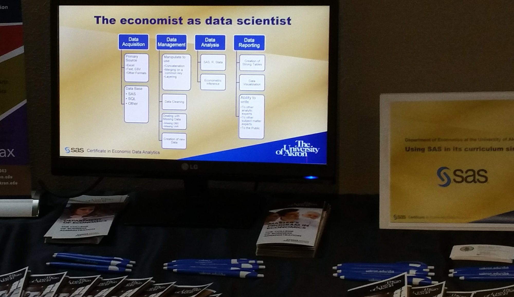
Full disclosure, we are a SAS school as part of the SAS Global Academic Program and offer both a joint SAS certificate to our students as well as offering them a path to full certification. 

(Update: The SAS joint certificate program has been rebranded and upgraded to the SAS Academic Specialization and is still a joint partnership between the college or university and SAS, but now in three tiers of responsibilities and benefits. We are at tier 3 and the highest level. Hit the link for more details.) 

We also teach R as well in our forecasting course and students are exposed to multiple other programs over their career including SQL, Tableau, Excel (for small data handling, optimization, and charting/graphics), and more. 

Buy This Book

Most typical econometric textbooks are in the multiple hundreds of dollars (not kidding) and almost none are suitable to really prepare for a job in data science. This book on Amazon is under $30 and is a great practical guide. Is it everything one needs? Of course not, but at the savings from $30 you can afford many more resources.

More SAS Examples

So it is natural given our thrust as a SAS School, that I would have preferred examples in SAS to assist the students. Nevertheless, I accepted the challenge to have students develop the SAS code to replicate examples in the book. This is a great way to avoid too much grading of assignments. Let them read Haider’s examples, say a problem that he states, and then solves with STATA. He presents both question and answer in STATA and my student’s task is to answer the problem in SAS. They can self check and rework until they come to the right numerical answer, and I am left helping only the truly lost.  

Overall, I love the outline of the book. I think it fits with a student’s first exposure to data science and I will know more at the end of this term. I expect to be pleased. (Update: I was.) 

If you are at all in data science and especially if you have a narrow idea that data science is only Machine Learning or big data, you need to spend time with this book, specifically read the first three chapters and I think you will have your eyes opened and a better appreciation of the field of data science.

Data Analytic Jobs in Ohio – May/June 2019

“Economists put the science in data science,” at least that is how the tag line goes on this blog. As we address our new Business Data Analytics degree in the College of Business Administration we need to know if our earlier plans for what is taught technically is still a good idea. Currently we teach SAS, R, and Tableau in Economics and students get SQL and JMP in other business courses. 

Searches for jobs in Ohio and within 100 miles of Arkon Ohio were preformed by the author on Indeed.com to see how many jobs included certain key words. The geographical area “Ohio” is well known and bounded, the area “100 miles of Akron” includes jobe no only in NE Ohio, but includes jobs outside NE Ohio as this definition touches the circle of influence of the Columbus area and the Pittsburg area. There is no way to know whether all jobs in Columbus and Pittsburg are counted or only those to the NE and NW respectively of both cities. 

Software Preference

SQL is the most mentionned software/language by far. After that R, Python, SAS and Tableau ranked in that order. Java and HTML are mostly used in web design and non analytic use. Salesforce was included because of the decision this week to acquire Tableau. 

Two interesting points. (1) Excel was originally included and eliminated from Figure 1, because Excel was mentionned in 19,370 jobs in Ohio and 12,129 for jobs with 100 miles of Akron, OH. (2) SAS and SQL was examined with the result that 60% of SAS jobs in Ohio and 67% of SAS jobs within 100 miles of Akron also included mention of SQL. 

Figure 1: Job including software. The software was included in the description, but not distinguished whether recommended or required. Source: authors calculations.

SAS Presence

There are a good number of SAS mentions which is good for our students since we are a SAS program offering a SAS Certificate in Economic Data Analytics.  As figure 2 shows, SAS is preferred by those employed by business, statistics and economics degree holders and figure 3 shows a preference for SAS in Fortune 500 companies. 

Figure 2 SAS use highest among Business, statistics and economics degree holders employed and surveyed. Source: Butchworks.com.
Figure 3: SAS preferred by Fortune 500 company employees. Source: Butchworks.com.

Skill areas included

Searches were also done by key words, not just on software with the results shown in Figure 4. Shocking to economists is that “econometrics,” the study of applying data analysis to typically economi data has only 29 listings in Ohio. However, every econometric student knows regression and logit and statistical inference and prediction and forecasting and more, and we know most economics students go into data analytics with ease, so what to conclude. The term econometrics is foreign to the job opportunity listings and perhaps it is time for a more relevant and descriptive naming of what is taught in econometrics.  

A typical economics student and especially one who gets our new Business Data Analytics can compete for most of the jobs including each of the keywords shown below making the new degree a very robust and rewarding one.  

Figure 4: Key terms of skills included at Indeed.com. Source: authors calculations.

Wraping up

To complete the analysis of jobs, Figure 5 shows that jobs mentioning “management” is incredibly large. i speculate that this is because job descriptions include not only jobs for managers, but also word use such as “reporting to management” and “data management.” 

Nevertheless, by including the names of departments in our college (except accounting), we get a sense of opportunities for various of our college majors, but a deeper search looking at sub fields such as supply chain, human resources, risk, insurance would have to be done, but the numbers are suggestive. 

Just like Excel as discussed above, the word “data” is mentionned in nearly 20,000 jobs in Ohio and almost 13,000 within 100 miles of Akron. So many jobs now require data savy on the part of employees that any of the colleges degrees offered in teh college of buainess administration at the University of Akron (including accounting) leads to lots of openings  advertising for their data skills.  

And the bottom line

Our new economics degree, Business Data Analytics promisses to produce graduates in high demand.

Figure 6: Mentions of the names of the various departments in the college and a comparison to searches for the word "data" and "Excel." Source: authors calculations.