Bubble Chart in SAS SGPLOT like Hans Rosing

Robert Allison blogs as the SAS Graph Guy. He recreates using SAS PROC SGPLOT the famous bubble chart from Hans Rosing of Gapminder Institute. Hans shows that life expectancy and income per person have dramatically changed over the years. Because Hans Rosing is a ot the father of visualizations, Robert produces this graph (shown here) and this very cool animation.

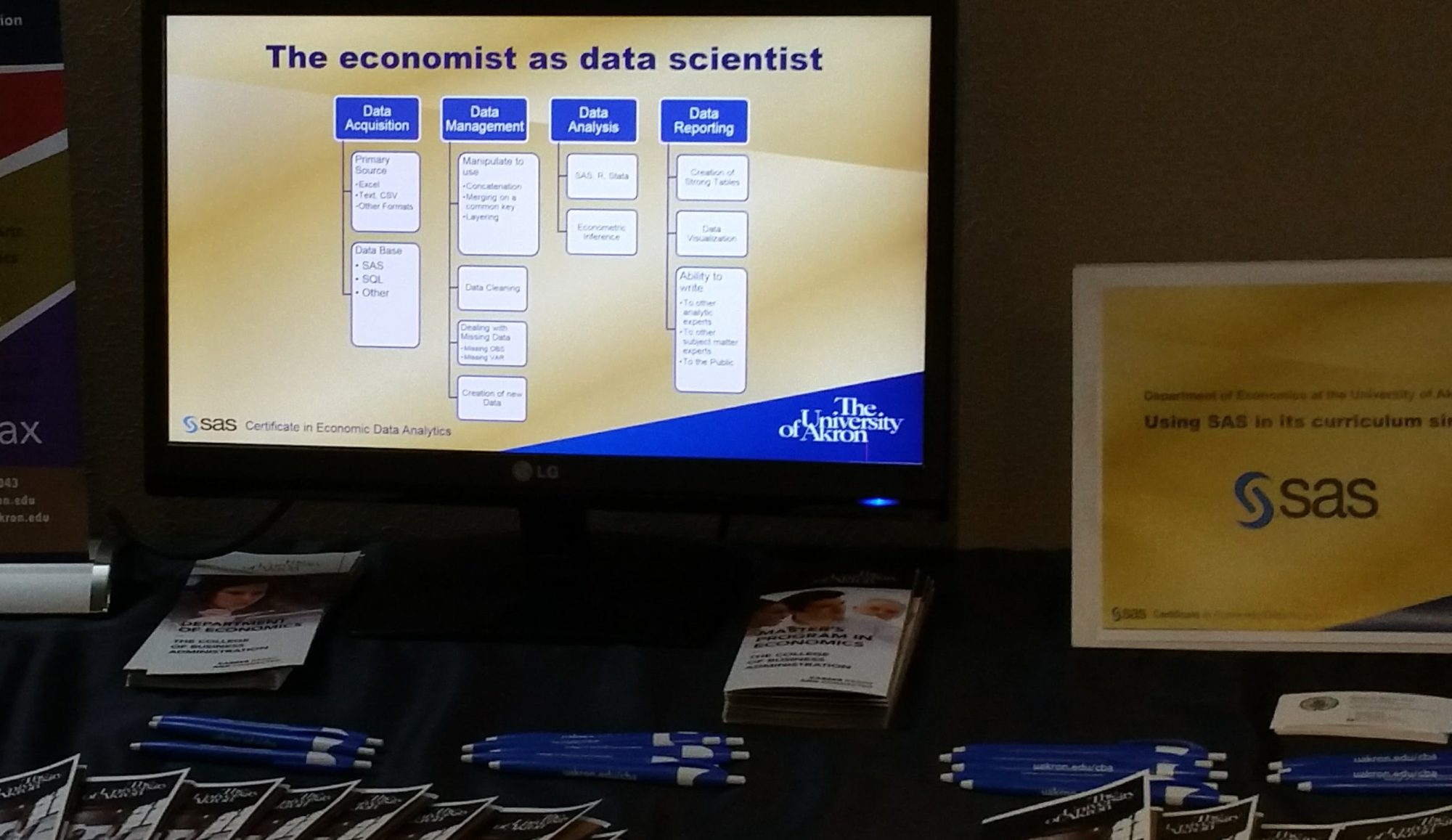
I can’t wait to see  Economic Freedom and income per person soon in one of these graphs. My students are trying to do this right now.  At this point in the term they are acquiring two datasets from Heritage on 168 countries, which contain the index of economic freedom for 2013 and 2018. Then they are cleaning and joining them so they can reproduce the following figure and table in SAS PROC SGPLOT for each year.


I have written about this project in prior terms here. Once they have this data joined and the above figures reproduced then they will move on to the final project for this semester. They will be looking through the 1600 World Development Indicators of the World Bank.  Each team of students will choose 5 and will join that to their data to answer the question:

Does Economic Freedom lead to greater Human Progress?

I may share their results, for now this is some pretty cool graphics from the SAS Graph Guy. 


Poverty Progress

Between 1980 and today the world is getting better, humans are making amazing progress. 

GDP per-capita in the US rose from $28,590 to $54,542, almost doubling as measured in 2010 dollars.

Worldwide, extreme poverty fell by over half as measured by the world bank.  (42 percent of the world’s population was in extreme poverty in 1981, but by 2015 only 9.9% of the world was in that state).

The number of wage salary workers that are paid at or below the federal minimum wage in the US fell from 15% to 2%.

The US Official Rate of Poverty rose by 0.5 percentage points.

Wait. What?

The world is improving even if you don’t think so.

Ask your friends about the drop in extreme poverty. I bet most get it wrong. My evidence is from the Misconception Study conducted by Gapminder Foundation. In fact, take their test to see how many misconceptions you have about the world. (It is right on the front page at https://www.gapminder.org/). Out of 12 questions administered to thousands across the world, the average score for every group is less than if the answer had been chosen by random. 

Once misconception is the world is getting worse, when indeed it is really getting much much better. But stories of better do not lead the news, only stories of woe. Further if you got your education in the 70s and 80s as I did you may have many misconceptions simply because you believe data learned correctly then has not changed. 

Why has the official poverty rate not fallen with all this world wide progress?

If world extreme poverty is down, why is the US official poverty rate so flat, nearly the same now as almost 50 years ago? The first problem is world wide poverty is bench marked on an absolute income standard. The OPR in the US is a relative income standard. They measure very different things. 

The second problem is income is the wrong measure for poverty. Using bad measures of important concepts like poverty creates a misconception that the problem is much worse and virtually unsolvable and attracts policy prescriptions to do exactly the wrong thing. 

The World Bank expects Extreme Poverty to essentially vanish by 2030. The US government has made no such forecast by any year in the future. 


What is the better measure of US poverty?

Meyer and Sullivan track what it costs to consume at a level not to be in poverty, that is, to create a consumption poverty rate (CPR) that is shown on the last track. The better question is not do the US poor have enough income, but do they have enough consumption? Without getting into what poverty programs are good and bad, the case of food stamps, now SNAP, is such instructive. Take two families with identical income and one of them received one or more consumption based forms of assistance such as SNAP and clearly one is relatively better off. The OPR does no consider any assistance to the people in poverty that they measure. 

But a goal to eradicate poverty needs to be based against an absolute standard with policy clearly targeting families to get them across that standard. We do not want people deprived. It is not about income, its about existence beyond deprivation. 

One of the reasons for the consumption poverty rate (CPR)  is consumption is a better predictor of deprivation than income. (Perhaps two people have the same income, but one cannot afford to put good food on the table, who is worse off?).

You can find their excellent paper here (https://leo.nd.edu/assets/249750/meyer_sullivan_cpr_2016_1_.pdf)

To listen to the news media and the advocacy groups everything is a crisis and a disaster and the world and the US is getting worse. The nice thing about data is it proves the obverse, the world and the US is getting better at a rate begun in about 1980 that is astonishing. But good news does not bleed and therefore will not lead.

So here is what is remarkable: From 1980 to 2015 the consumption poverty rate fell by 9.4 percentage points, while the official poverty rate rose by 0.5 percentage points.

So what make more sense, that the US has a poverty rate of 13.5 (in 2015) that is virtually impossible to lessen or eliminate, or a Poverty rate based on consumption that is 3.5% of the population that we might be able to further reduce.  

I would like to see the end of poverty wouldn’t you? 

Be a Data Skeptic and do your own research

We hear constantly about bias reporting and fake news and you should be motivated to be skeptical about any data you hear reported and motivated to search out the actual facts.

In other cases, such as the FBI’s hate crime data, the data are not reliable without understanding how it is collected. The data is fine, but year to year comparisons are not easily possible because of the data design. (see The importance of data skepticism. Hate crimes did not rise 17% in one year. )

Many data websites do exist to help you find actual facts. 

Some of the best fact based sites are
https://Justfacts.org
https://Gapminder.org
https://Fred.org
https://humanprogress.org.

So the message is be humble, don’t believe everything at face value and learn how and do your own research.