COVID-19 in the State of Ohio, updated daily

Updated 4/11/2020:  Everyone is interested in how we are doing in Ohio during the COVID19 pandemic. Accordingly, I look at the data from the Ohio Department of Health and assemble it into a report for you. You can read my full report below which includes multiple graphs and tables and can download the pdf. I intend to update the pdf report each day as new data becomes available.  Also, you should check back often as the information displayed will change with new data. I will also offer new items as I think of them. 

Full disclaimer, I am not an expert in epidemiology nor have I attempted to model the behavior and predict the future. On LinkedIn,  I have written about the importance of having a qualified subject matter expert paired with each data modeler. I am nonetheless interested in any suggestions you have. I have added a footnote to each table explaining that the definition of a case changed on April 10 from “confirmed (by a test) cases” to the “confirmed cases plus probable cases” which inflates the data by 47 cases on April 10. This to match definitions by the CDC, but worries me as to the lack of consistency before and after the change date.

First up is Weekly changes in the number of cases, hospitalizations, and deaths. A look at the number of cases shows a considerable decline in the cases. Every data point is an average of the last week of cases. When changes are on way down it suggests that the curve of the total caseload is indeed being bent.

weekly changes in cases of covid-19

Rates of hospitalizations and deaths are shown in the next graph. This past week Amy Acton said Ohio has tested 50,000 people and our cases are just under 6000, so that means in rough measure that of everyone tested, the large majority of are showing symptoms or clearly in harm’s way, that the positive results are that about 12 percent. That suggests the actual death rate which is 3.9% or all positive cases, maybe as low as (12%) of 3.9% or about 0.4% of all those tested and much less than the death rate out of the population of 11 million. Of course, I do not have individual testing data and this is a bit of hopeful speculation.

rates of cases


I also did a visualization of the hospitalization and death rates by age and sex and posted that to LinkedIn. You can access that here. Similar numbers and heatmaps are in the full report below.

I used SAS® to organize and analyze the data.

Because people are interested in how we are doing in Ohio during the COVID19 pandemic I hope this is of interest to you.

OH_report_COVID19

Download the report here.

Proper citation requested. Steven C. Myers. 2020. Ohio Covid19 report. accessed at https:econdatascience.com/COVID19 on (your access date).

Request for Comments to myers@uakron.edu
SAS Boot Camp

So this should be fun! We have some students who need a quick dive into SAS programming so they can succeed in their required classes. So starting Friday, January 24, I will offer four 2-hour sessions trying to get them up to speed. I have opened it to any student or faculty at the University of Akron. This boot camp will cover four sessions shown to the right and will acquaint the participant with issues and problems in economic business data analysis. The sessions will progress from raw data-step programming into exploratory and data cleaning and finally through applied econometrics. 

Sessions 2, 3, and 4 are based on the first three papers on My Analytic Papers Using SAS page. See that page for links to the data and code on my github.

Four 2-hour Sessions:

Fri., Jan. 24
Introduction to SAS Programming
Fri., Jan. 31
Time Series Data
Fri., Feb. 7
Cross Section Data
Fri., Feb. 14
Evaluating Decisions

The University of Akron
College of Business Administration
Analytics Lab 176

10:00 am to 12:00 pm. 

Seating is limited and priority will be given to the students and faculty of the CBA. 

Only those with current student or faculty status and a valid university of Akron email address may register.  Those getting seats will be notified on January 22. 

ASSA2020 – Teaching econometric students with SAS(r)

As the new decade begins, I am preparing for my flight to San Diego where my colleague, Sucharita, and I will be interviewing for the Department of Economics as we seek to hire two tenure-track assistant professors for the department to replace the three faculty who are leaving in May. I always enjoy the ASSA (Allied Social Science Association) meetings, but this time I will miss all of the sessions and activities as we have a full interview schedule. As I have reported Data Scientist Jobs Are Increasing For Economists: Evidence from the AEA. We are looking for those who will teach data science to our students.

S285_sas100KIt has been 41 years since I began my academic career. I leave it at the end of this Spring semester and I will miss teaching econometrics and data science to our students. Those who know me understand my passion for SAS(r) in the econometrics curriculum and I am not dissuaded by the presence and importance of R and Python.  Students who learn to program in SAS, learn far more than the analytic power of the worlds leading analytical solution. They learn in one environment how to acquire data, to manipulate and manage that data, to analyze it with powerful procedures and to visualize and report results from that data.

SAS is a great skill for students and their proficiency with SAS prepares them both for careers in SAS and for careers using other languages and systems. I argue from the experience of my students that SAS provides a platform from which those students may easily learn any other language or system that an employer will have. I cannot say the same for R and Python, partly out of ignorance and partly because I have not heard or read that R and Python provide the same firm foundation for future learning of other languages and systems.

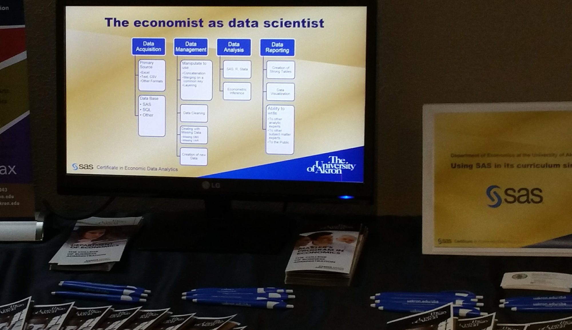
Every new Ph.D. economist we interview will be proficient in STATA, few will be proficient in SAS, and many will not list SAS in their skill set.  The willingness of the candidate to learn and teach SAS is critical to our Economics  and Business Data Analytics programs. The University of Akron partners with SAS Global Academic Programs and offers a joint Certificate in Economic Data Analytics to each qualified graduate. Our students are ready to turn data into action using SAS and the unique qualities of critical thinking, problem solving and story telling that is part of all economic curriculums. Economists do put the science into data science. Data Science is far more than predictive analytics. You can make predictive analytics work beautifully in many cases, but there is no substitution for knowing why something works. Economists are masters of explanation and causality, and have the statistical prowess to back it up.

In an earlier blog posting I reviewed the data science textbook I used last semester (A Data Science Book Adoption: Getting Started with Data Science) and in one of the figures I showed that in Ohio while there were over 600 jobs lisiting ‘SAS; there were just fewer than 30 listing ‘STATA.’  Today as I write this there are 521 SAS listings and only 15 STATA listings in Ohio, and nationwide the numbers are 17K SAS jobs to 1.5K STATA jobs. (Indeed.com). I think we are on the right track.

Teaching economics and econometrics with SAS gives students a firm foundation for productive and profitable analytic careers in all data science fields. And our students have done very well in that space.

Wish us luck as we look for two new assistant professors of economics who will contribute to our students’ success. And for those who have read this far, I have been honored as the SAS Distinguished Educator for 2020 and will receive that award at the SAS Global Forum in Washington DC (March 29-April 1). I will also speak on educating economics students for data science careers. You too can attend, register here. Message me at LinkedIn if you are coming, I would love to see you. – Steven C. Myers (Akron)

Economic Freedom: Solve Problems, Tell Stories

Time and time again we hear employers wanting two qualities out of their data scientists, be able to solve problems and tell stories. How important is economic freedom? Does it lead to greater standards of living? The answer can be shown in tables of results well laid out, but visualizing those results has an even greater impact and better tells the story.

If a “picture is worth a thousand words” then a SAS SGPLOT is worth many pages of tables or results. Can you see the story here?

Economic Freedom is shown to be associated with ever higher standards of living across countries.

The problem is whether countries with higher levels of economic freedom also have higher standards of living. It appears that is true. The association seems undeniable. Is it causal? That is another question that the visual begs. Chicken and Egg reasoning doesn’t seem likely here. It does appeal that the association is one way. For that to be established, we have to answer is economic freedom necessary for higher standards of living. And we have to determine that if the economic freedom had not been accomplished would the standard of living not been as high.

More on that in a future post on the importance of “why.” For now, enjoy the fact that their seems to be a key to make the world better off. Oh, not just from this graph, but from countless successes in countries in the past. My undergraduate analytic students are expanding on this finding to see if their choices from the 1600 World Development Indicators of the World Bank hold up in the same way as GDP per-capita does here in this graph. We/they modify the question to “Do countries that have higher economic freedom also have greater human progress?” I am anxious to see what they find.

The Economic Freedom data comes to us from The Heritage Foundation. Let me know what you think about the visual.

This is a followup to my post on my blog at econdatascience.com “Bubble Chart in SAS SGPLOT like Hans Rosing.”

The SAS PROC SGPLOT code to create the graph is on my GITHUB repository. It makes use of Block command for the banding and selective labeling based on large residuals from a quadratic regression. The quadratic parametric regression and the loess non-parametric regression are to suggest the trend relationship.

Sorry Data not included.

Bubble Chart in SAS SGPLOT like Hans Rosing

Robert Allison blogs as the SAS Graph Guy. He recreates using SAS PROC SGPLOT the famous bubble chart from Hans Rosing of Gapminder Institute. Hans shows that life expectancy and income per person have dramatically changed over the years. Because Hans Rosing is a ot the father of visualizations, Robert produces this graph (shown here) and this very cool animation.

I can’t wait to see  Economic Freedom and income per person soon in one of these graphs. My students are trying to do this right now.  At this point in the term they are acquiring two datasets from Heritage on 168 countries, which contain the index of economic freedom for 2013 and 2018. Then they are cleaning and joining them so they can reproduce the following figure and table in SAS PROC SGPLOT for each year.


I have written about this project in prior terms here. Once they have this data joined and the above figures reproduced then they will move on to the final project for this semester. They will be looking through the 1600 World Development Indicators of the World Bank.  Each team of students will choose 5 and will join that to their data to answer the question:

Does Economic Freedom lead to greater Human Progress?

I may share their results, for now this is some pretty cool graphics from the SAS Graph Guy. 


My time with the MS Analytics Students at LSU

Last week I had the pleasure of presenting two papers at the 2019 South Central SAS Users Group Educational Forum in Baton Rouge on the campus of the E. J. Ourso College of Business at Louisiana State University. My thanks to Joni Shreve and Jimmy DeFoor who chaired this conference and treated this traveler so well. (Especially want to call out the chicken and sausage gumbo). I want to reflect on two things. The students and SAS.

As a LSU Professor, Joni Shreve had an outsized role in not only serving the forum as its academic chair, but in also encouraging her MS Analytics students to attended over the two days, October 17-18, 2019. Many of those students attended one or both of my papers. I met most of them and had long side conversations with a few. To a person I was impressed with their interest in analytics and what this economist from up north had to say about the state of applied analytics. These students each have very solid futures. Of course I encouraged them to add an applied econometrics course to their studies (see here or here or even here).

When I started writing the papers for this conference I was focused on SAS. It is after all a SAS conference. I was happy to contribute what may be new SAS techniques to the participants, but the fuller message was not about SAS techniques, but about the process of problem solving, and turning insights into solutions. It is about telling the story, not of SAS, but of the problem and solution. Firm articulation of the problem and the development of a full on testing strategy are messages that rise above any particular software. I am grateful to participants, students and faculty alike who in conversation after assured me that they got the message.

The student are currently in a practicum where Blue Cross and Blue Shield of LA, Director of IT, Andres Calderon, as an Adjunct Professor at LSU, is directing them in a consultative role helping them solve a real business problem. This is ideal education for analytics students. I want to thank Andres for his kind words about my presentations and the value of them to the wider analytic community. I know our conversations will continue and I will be the better for them, better than that, so will the students.

I was made to feel a part of the LSU MS Analytics program if even for two days and I am grateful to Joni Shreve for letting me have that rewarding opportunity.

And about the picture, my wife has threatened to tell Zippy (UA mascot).

Data Scientist Jobs Are Increasing For Economists: Evidence from the AEA

Economists, especially Econometricians, are in hot demand in the field of Data Science. Last March I posted Amazon’s Secret Weapon:  Economic Data Sciences which was one of many similar articles on the high demand. It is the entire premise of this blog and my work at university is to highlight this and point economists and our business data analytic students in that direction. Our curriculum is centered on SAS because having the students learning to program at a base level and to learn the power of SAS is a good basis for future job employment (see Data Analytic Jobs in Ohio – May/June 2019).

Because we are looking for a couple of PhD economists for tenure track positions, I thought to wander around in JOE (Job Openings for Economists) and eventually wandered into wondering how many Data Science jobs were directly advertising in the JOE competing with academic positions (including ours). 

So to sharpen my SAS SGPLOT skills i collected some data and found that indeed Data Scientists are in increasing demand over time in JOE , bur not as much as exists in the general market of Indeed.com.  Clearly in JOE job listings in the August to December timeline are the best time to find a data science job, and August 2019 should grow as more jobs are added leading up to the ASSA meetings in San Diego in January. If you’re there look me up, but I suspect I will be in an interviewing room from dawn to dusk. 

Enjoy! Comments welcomed. 


Updated to final 2019-2020 numbers
Preliminary 2019-2020 numbers
What do you think about the SGPLOT?
5/5

For those wanting to see the SAS code

My apologies, Elementor does not handle txt code so well, or I have not yet figured that out. (Small amount of research shows the lack of a code widgit  is a problem with Elementor.)

Code with data and image are available at https://github.com/campnmug/SGPLOT_Jobs

data ds;
input date MMDDYY10. total DStitle NotDStitle;
t=_n_;
Datalines;
2/1/2014 0 0 0
8/1/2014 2 2 0
2/1/2015 0 0 0
8/1/2015 5 2 3
2/1/2016 1 1 0
8/1/2016 11 5 6
2/1/2017 1 1 0
8/1/2017 12 6 6
2/1/2018 2 1 1
8/1/2018 14 11 3
2/1/2019 7 4 3
8/1/2019 12 6 6
;
run;
Title1 bold 'Data Scientist Jobs Are Increasing For Economists: Evidence from the AEA';
Title2 color=CX666666 'Advertisement for Data Scientists in Job Openings for Economists (JOE)';
title3 color=CX666666 "Counts shown are the result of a search of all listings for 'Data Scientist'";
proc sgplot;
vbar date / response = total discreteoffset=-.0 datalabel DATALABELATTRS=(Family=Arial Size=10 Weight=Bold)
legendlabel="Total Data Scientist Jobs" dataskin=gloss;
vbar date / response = DStitle transparency=.25 discreteoffset=+.0 datalabel DATALABELATTRS=(Family=Arial Size=10 Weight=Bold)
legendlabel="Job title is 'Data Scientist' " dataskin=gloss;
yaxis display = none ;
xaxis display = ( nolabel);
inset "To put this in perspective:" " "
"Most 'Data Scientist' and 'Economist' jobs"
"are not advertised in JOE"
"A search for 'Economist' and 'Data Scientist'"
"on Indeed.com yields 514 jobs on Oct 14, 2019"
/ position=topleft border
TEXTATTRS=(Color=maroon Family=Arial Size=8
Style=Italic Weight=Bold);
inset "Aug 2019" "preliminary"
/ position=topright noborder
TEXTATTRS=(Color=black Family=Arial Size=8
Style=Italic );

format date worddate12.;
footnote1 Justify=left 'JOE listings are at https://www.aeaweb.org/joe/listings';
footnote2 Justify=left 'Only active listings in either the Aug-Jan or Feb-Jul timeline were searched.';
footnote3 Justify=left 'Search conducted on Oct 14, 2019, so the last count will grow as new jobs are entered into the system.';
footnote4 ' ';
footnote5 Justify=left bold Italic color = CX666666 'Created by Steven C. Myers at EconDataScience.com' ;
run;
run cancel

Ethics Rules in Applied Econometrics and Data Science

Failing to follow these rules brings about ethical implications if not direct unethical behavior. To knowingly violate the rules is to be, or at least risk being, unethical in your handling of data.

I am honored to have a version of this essay appearing in Bill Frank’s 97 Things about ethics everyone in data science should know. Pick up a copy now. 
Published August 25, 2020

I have taught ethics in Applied Econometrics and Data Analysis for at least the last 20 years. But I rarely have used the word ethics, resorting to phrases such as data skepticism, and other attitudes that suggest acting ethically.

Nothing in the past 20 years has had as much impact on me and my classroom teaching and my ethics of data analysis as Peter Kennedy’s “Sinning in the Basement: What are the Rules? The Ten Commandments of Applied Econometrics.” This essay also appears in his Guide to Econometrics (Kennedy, 2008).

From the moment I read this paper, I was completely transformed and forever a disciple of his. I was fortunate to host him on my campus where he spoke of the misuse of econometrics and failure of research to make it past his editor’s desk at the Journal of Economic Education. One example, a paper is rejected because they did not acknowledge a problem in their analysis, ignored it, and probably hoped the editor would not notice. Being honest and transparent enough to acknowledge a problem of which the authors were aware, but unable to solve is sometimes enough Peter would point out. Hiding one transgression suggests other ethical abuses of data.

I used the word ethical, but Peter did not, preferring the oft used word sin and sinning. But the point is made. When I got my Ph.D. at The Ohio State University in 1980, I had taken nine separate statistics and econometrics courses over the 5 years that I was there. I learned classical estimation and inference from some of the best professors, and yes we had to “sin in the basement” (by pilgrimage to the mainframe computer in those days) because there was scarcely a day’s instruction of how to use the computer much less conduct what Peter would call the moral obligation of applied econometrics 20 years later.

Kennedy says “… my opinion is that regardless of teachability, we have a moral obligation to inform students of these rules, and , through suitable assignments, socialize them to incorporate them into the standard operating procedures they follow when doing empirical work.… (I) believe that these rules are far more important than instructors believe and that students at all levels do not accord them the respect they deserve.” (Kennedy, 2002, pp. 571-2)” I could not agree more and have tried to follow faithfully these rules and to teach my students and colleagues to do likewise.

Failing to follow these rules brings about ethical implications if not direct unethical behavior. To knowingly violate the rules is to be, or at least risk being, unethical in your handling of data. To unknowingly violate the rules would nevertheless lead to unintended consequences of poor outcomes that could be avoided.

The Rules of Applied Econometrics

Rule 1:

Use common sense and economic reasoning

Rule 2:

Avoid Type III errors

Rule 3:

Know the context

Rule 4:

Inspect the data

Rule 5:

Keep it sensibly simple

Rule 6:

Use the interocular trauma test

Rule 7:

Understand the costs and benefits of data mining.

Rule 8:

Be prepared to compromise

Rule 9:

Do not confuse statistical significance with meaningful magnitude

Rule 10:

Report a sensitive analysis

Failing to well and fully articulate the problem (rule 1) is so critical that to not spend time on the problem and the common sense and economic theoretical solution can lead to serious flaws in the study from the very first step. It might lead to a violation of rule 2 where the right answer to the wrong question is discovered? What if you fail to inspect the data (Rule 4), fail to clean the data and provide for necessary transforms, fail to control for selection bias, then you will have results based on assumptions that are not realistic and produce wrong results that are unduly influenced by the dirty data. The importance of this cannot be over emphasized. Recall that Griliches exclaims that if it weren’t for dirty data, economists wouldn’t have jobs. What if you violate Rule 7 and, knowingly or not, allow the data to lie to you. In the words of Nobel Prize winning economist, Ronald Coase (1995), “If you torture the data long enough, it will confess.” A violation of Rule 9 might lead you to worship R2 or participate in p–hacking. It might cause you to ignore a huge economic implication (large magnitude) only because it has a large p-value. Violations of Rule 10 may be the largest of all. Suppose in the spirit of discussing “sinning” you believe your model is from God (as suggested by Susan Athey) then why would you ever look at alternative specifications or otherwise validate the robustness of your findings. What you find is what you find and alternatives be dammed.

“Many data scientists make bad decisions – with ethical implications – not because they are intentionally trying to do harm, but because they do not have an understanding of how the algorithms they are taking responsibility for actually work. (Jennifer Priestly, August 2019, LinkedIn post).” Likewise many in the field who ignore the Rules for Applied Econometrics risk doing real harm, not out of intentionality, but out of ignorance or neglect. This later lack of motive is just as real and likely more widespread than the intentional harm, but harm occurs in any event.

The American Economic Association adopted ethical, code of conduct guidelines that states in part: “The AEA’s founding purpose of ‘the encouragement of economic research’ requires intellectual and professional integrity. Integrity demands honesty, care, and transparency in conducting and presenting research; disinterested assessment of ideas; acknowledgement of limits of expertise; and disclosure of real and perceived conflicts of interest.”

The AEA statement does not go directly to data ethics, but is suggestive since little economic research and no applied economic research can be conducted without data. The AEA statement is a beginning, but I suggest that those who do applied economic research would do well to hold to the rules for sinning in the basement. This is so important now since going to the basement is no longer the norm and many more analysts should be trying to avoid sinning wherever and whenever they have their hands on their laptop.

References:

American Economic Association (2018) Code of Professional Conduct, Adopted April 20, 2018, accessed at https://www.aeaweb.org/about-aea/code-of-conduct  on October 7, 2019.

Coase, Ronald. (1995) Essays on Economics and Economists, University of Chicago Press,

Kennedy, Peter E. (2002) “Sinning in the Basement: What are the rules? The Ten Commandments of Applied Econometrics.” Applied Econometrics, Blackwell Publishers Ltd. Accessed at https://onlinelibrary.wiley.com/doi/abs/10.1111/1467-6419.00179

Kennedy, Peter E. (2008) A Guide to Econometrics, 6th edition, Cambridge, MIT Press.

Gola, joanna. 10 Commandments of Applied Econometrics (series), Bright Data, SAS Blog, first in the series accessed here: https://blogs.sas.com/content/brightdata/2017/03/01/10-commandments-of-applied-econometrics-or-how-not-to-sin-when-working-with-real-data/

Priestley, Jennifer L. (2018) “The Good, The Bad, and the Creepy: Why Data Scientists Need to Understand Ethics.” SAS Global Forum, Dallas. April 28-May 1, 2019.

Further Reading:

Zvi Griliches (1985) “Data and Econometricians–The Uneasy Alliance.” The American Economic Review, Vol. 75, No. 2, Papers and Proceedings of the Ninety Seventh Annual Meeting of the American Economic Association, pp. 196-200 accessed at http://www.jstor.org/stable/1805595 on October 7, 2019.

DeMartino, George and Deirdre N. McCloskey, eds. (2016). The Oxford Handbook of Professional Economic Ethics, Oxford University Press, New York.

Author contact:

Steven C. Myers
Associate Professor of Economics
College of Business Administration
The University of Akron
myers@uakron.edu
https://econdatascience.com
https://www.linkedin.com/in/stevencmyers/

Time Series data will lie to you, or take a random walk in Chicago.

Do you know that data lies? Come talk to me at MWSUG (Midwest SAS Users Group Conference) and I will help you protect yourself against lying data.

One of the papers i am presenting is on time series data. Time series analysis is pretty intense and there is as much art as science in its modeling. My paper is BL-101 “Exploring and characterizing time series data in a non-regression based approach.

Nobel Prize economist Ronald Coase famously said:  “If you torture the data long enough, it will confess.”  It will confess to anything, just to stop the beating. I think there is a corollary to that, “If you don’t do some interrogation, the data may just tell a lie, perhaps what you want to hear.

Consider the following graph, assembled with no torture at all and not even a short painless interrogation. The graph shows that money supply and the federal debt track each others time path very closely. It tempts you to believe what you see.  Do you believe that when the money supply increases we all have more to spend and this will translate into dept? Do you have an alternate reasoning that explains this movement? If so, this graph confirms your thoughts and you decide to use it to make or demonstrate or prove your point. Good stuff huh?

Sadly you just fell to confirmation bias and because you have failed to investigate the data generating process of the series, you fell for the lying data. You have found correlation, but not causation. in fact, you may have found a random walk.  Don’t cheer yet, that is not a good thing to make your case. 

But,” you think, “I like that graph and besides the correlation between Money Supply and Debt is really high so it has to mean something! right?

Sadly, no. 

Mathematically, if the series are random walks then changes in the series are only generated by random error. Which means the correlation between the two variables will be very low. 

A random walk takes the form of

y(t) = y(t-1) + e

which says that the currently observed variable at time t, is equal to the immediate past value plus a random error term. The problem here can be seen by subtracting y(t-1) from each side yielding a new and horrifying equation that says that any growth observed is purely random error, that is

Change in y = y(t) – y(t-1) = e.

Since you cannot write an equation to predict random error, it stands to reason that you cannot predict current or forecast future changes in the variable of interest.

Consider the next graph. The percentage change over the last year in the money supply is graphed against the percentage change over the last year of debt.  See a definite pattern? I do not. 

The correlation between money supply and debt in the first graph is 0.99 where 1.0 would be perfectly one-to-one related. In the second graph the correlation falls to 0.07 meaning there is almost no relationship between them.

The lesson: You should do more investigation, torture is not necessary, but no investigation is never desirable. 

Economists are obsessed in determining the data generating process (DGP)which take a lot of investigation. Economists know traps like random walks and know ways to find the true relationship between money supply and debt, if any. Ignore the DGP and your quick results could be a lie. Torture the data, and again you could find a lie (it just may take a long time of wasteful actions). 

So come take a random walk in Chicago with me at MWSUG. 

After the conference my paper will be available on the conference proceedings.